One of my objectives doing this redesign is to “add some personality back to the my little corner of the web.” I’m finding that I lean heavily toward pretty conservative colour palettes, so I think most of that will take the form of easter eggs and microinteractions.
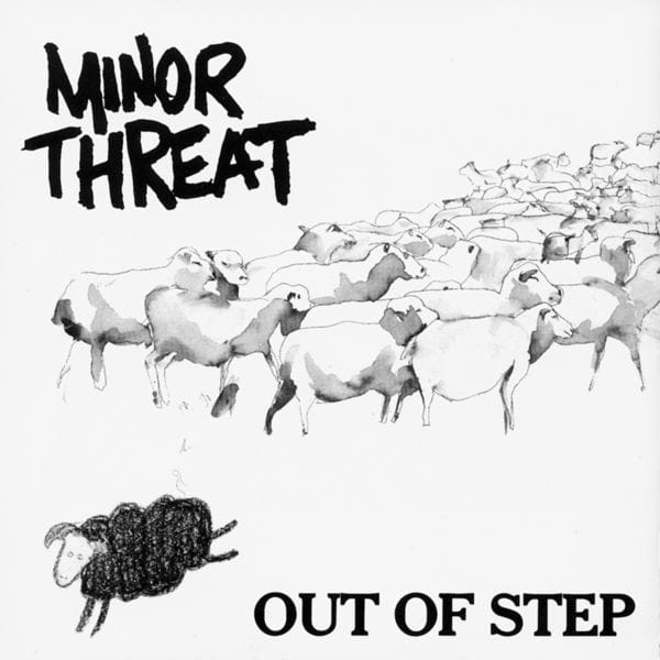
The first thing I did when I was code the sheep in the footer. As I mentioned in an earlier post, it’s from the cover of Minor Threat’s Out of Step, a classic hardcore punk album. I’ve been using a stylised, pixelated version of it as my favicon for years so it seemed like an obvious choice to promote that imagery to the main page. (Many years ago I tattooed the sheep on my own leg using a machine my friend bought on Craigslist.)

The sheep itself is a bit boring so I thought to add the scratch-off effect. The whole rectangular div has a background image. The black squares have background-color: black (not actually black but the dark grey colour I’m using) and the rest have background-color: white. Hovering a black square fires a bit of JavaScript that adds a class with background-color: transparent, revealing the background image (a headshot of me).
Here it is on CodePen where I first made it work. It’s about 23kb worth of spans inside of a parent container using display: grid. I think this could be reduced significantly. When I started, though, I thought span tags would be lighter weight and easier to manipulate than an SVG with each pixel as a separate element. I also don’t have any other heavy assets like webfonts on the site (yet) so it felt like an acceptable price to pay.
Listen to the album on Spotify.