I got three things done on the redesign since posting yesterday’s article.
Firstly, I brainstormed a little “backlog” of UX improvements and creative ideas on a Trello board. A couple of examples include reimplementing the email address interaction I had in an earlier design, visualising blog article frequency, and “using audio in some fun way”. But while doing that I realised I needed to step back and rethink about the order in which I’m presenting everything.
So I did a little IA exercise. I thought about what I want visitors to do first, whether the site should have one or more pages, how to truncate sections with a lot of entries or content, etc. Here’s where I ended up this evening:
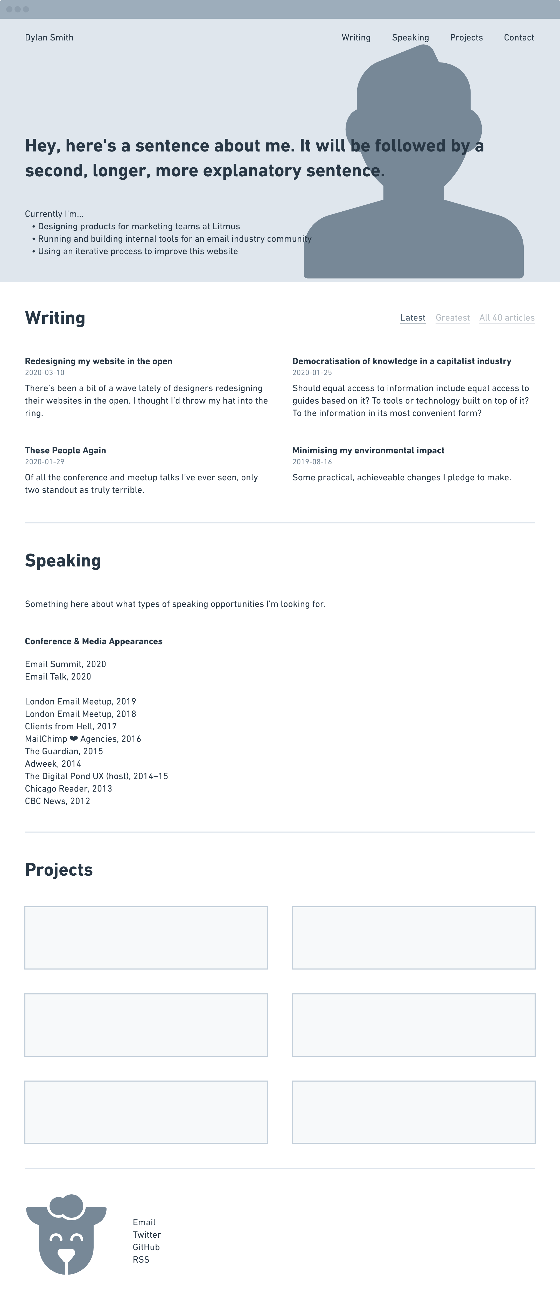
That whole speaking section is new. I need to flesh it out but essentially I’ll end up with some sort of appeal to event organisers about what types of talks and events I’d like to do; and a list of past appearances at on events, podcasts, or media outlets (with links where applicable).
The Writing and Projects sections are mostly the same so far. I did think about how to improve the All posts/Highlights toggle I have on my articles today. If the list is that high up the page, I don’t want to show dozens of articles by default. I came up with Latest/Greatest/All… so I can show the last few, my favourite few, and give people the option to explore further. Most will find my site through a bio link or direct link to an article so I think it’s unlikely that they’ll necessarily care about five years of my blog history.
I’m not sure yet what I’ll do with those navigational links. My initial idea was for it to be fixed as you scroll down the page, but after seeing all of the sections laid out in the wireframe I don’t think this little content on a single page design warrants that treatment. Now I’m considering leaving it up top, scrapping it altogether, or maybe moving it just beneath the hero section. I’ll explore that last idea further but probably won’t make a decision until I’m working in code and can actually feel how long the page is with everything on it for real.
I realise this looks pretty damn typical so far so keep in mind that it’s just a wireframe. The last thing I did was a CodePen of an interactive pixel art thing in CSS grid based on my current favicon (which is a pixelated interpretation of the sheep on Minor Threat’s Out of Step cover). That’s why there’s a big sheep icon in the footer of the wireframe. I’ll write more about that in a later post, but that’s the type of thing I hope to add throughout for some character.
Based on what I’ve come up with so far, I think the necessarily approach will be to spin up a new branch of the site and build it up a section at a time. There are some typographical decisions that will be much easier if I don’t have to consider today’s markup. I may start with just the intro, articles, and footer just to get moving. TBD.