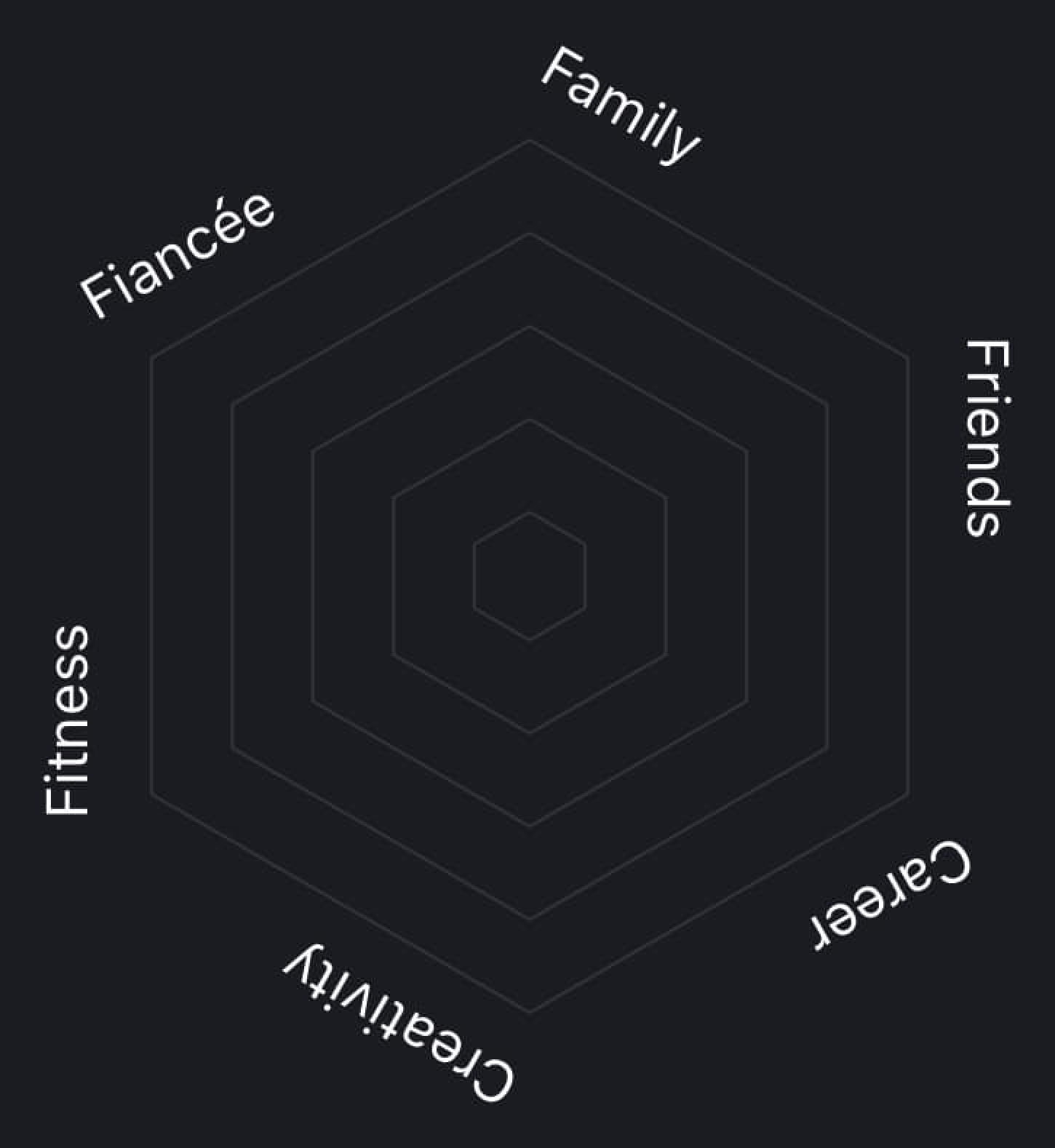
My last post about my priorities going into 2024 reminded me of this radar chart template I made in 2019. Each spoke represents an area of focus and can be evaluated from 1–5, 5 being the highest and plotted on the outermost ring.

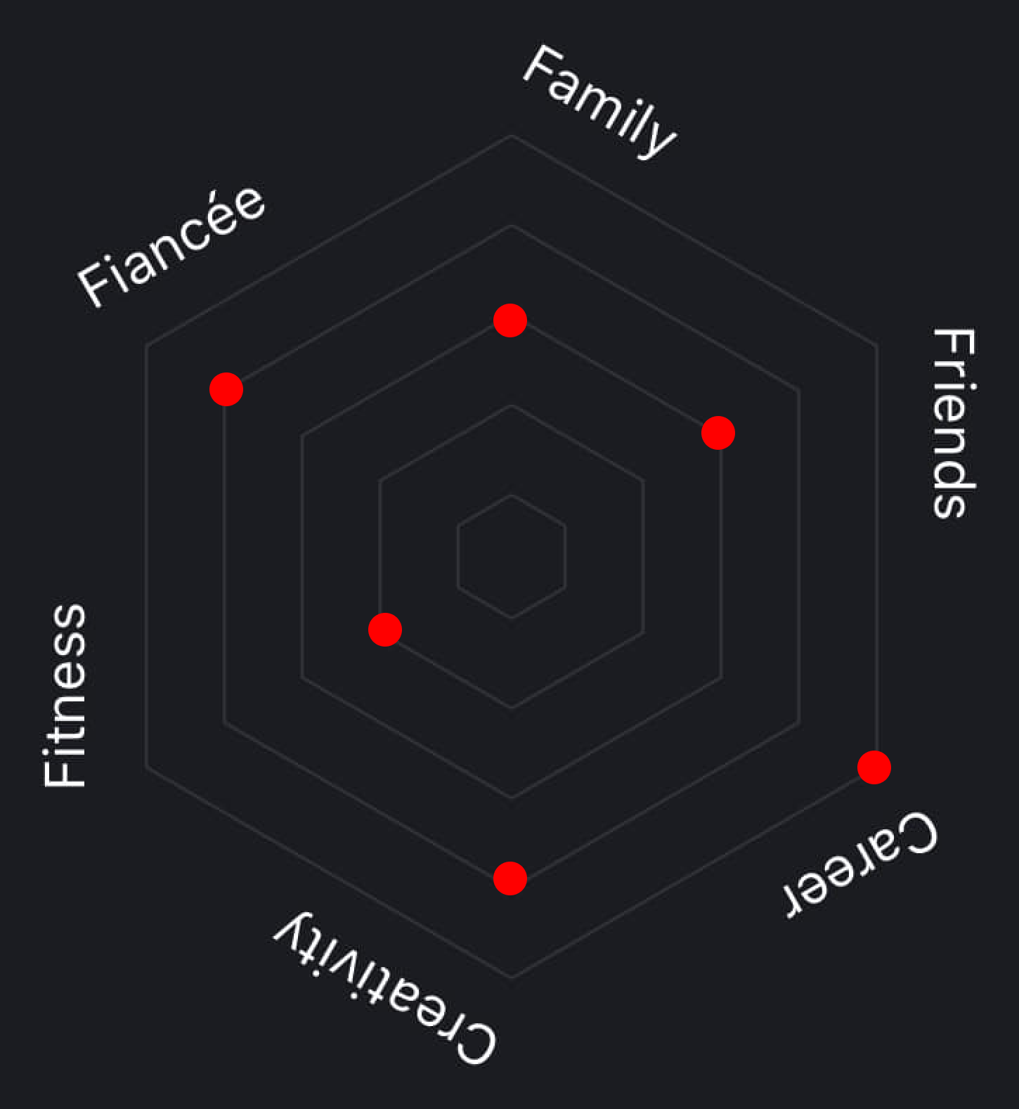
The system was pretty lofi. I just saved the above image on my phone and set a recurring reminder to duplicate it and add data points every week or so with the iOS drawing tool. The better I felt I did in that category that week, the higher the rating. If I dropped the ball, low rating.
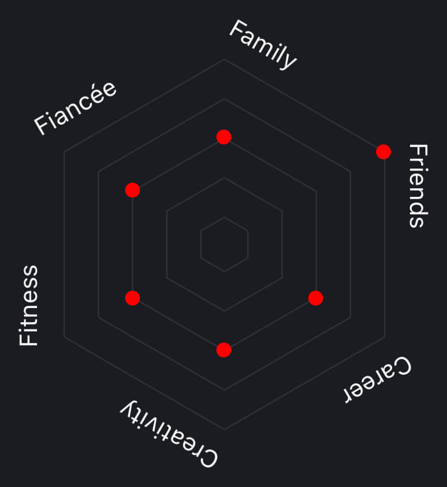
The result would look something like this.

I saved all of the images in the same folder which let me scrub through and see the changes over time. Perfect 5s was never the goal — that’s a path to burnout. It’s all about managing the balance. If a rating was low, I knew to pay it some mind and book a dinner date, text a friend, or call my mom. It helped visualise focus and make sure nothing I decided I cared about was slipping through the cracks.

At one point I wrote a web app for this, because of course I did. I could add or remove categories and add sets of values. I used Chart.js to generate the chart. It’d probably make a better iOS app with push notification reminders.
Eventually I stopped doing it. It hit a sweet spot for me between goal setting and habit tracking, but after it trained me to be conscious of balance and progress, it became less useful.