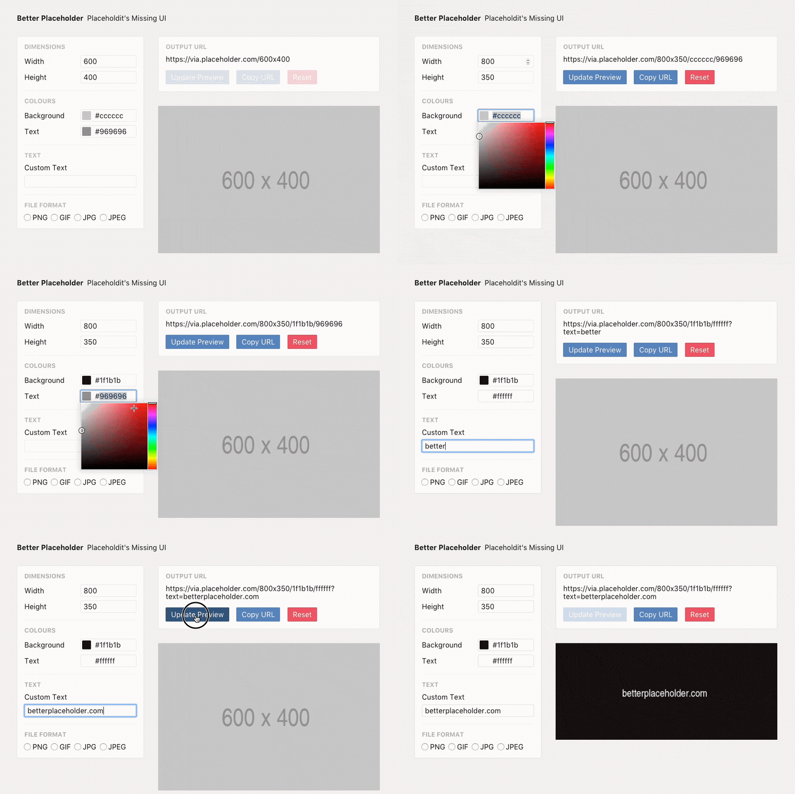
If you’re a designer or developer, placeholder images are inevitable. Most recently, I’ve been using a lot of them in development to mark spots where user-generated content will later appear. Luckily, there are a lot of services that allow you to create placeholders without having to host images yourself, usually with some sort of URL pattern for changing dimensions or adding text.
Placehold.it — recently acquired and now at placeholder.com — has always been my favourite due to the high level of customisation it offers. My favourite way to use it is by changing the colours to compliment my design, and changing the text to either represent what the image will be or to give clients a hint at what size image they might need to use in its place.
The problem is that everyone just uses the boring default greys (I know you’re picturing it right now) because the URL structure is impossible to remember. Getting the dimensions sorted is easy, but how do you separate the background and text colours? Is it a question mark or backslash before the text string? You can change the file format?!
To solve this for myself, I spent a little time building Better Placeholder.
Better Placeholder is a builder that generates placeholder.com URLs from a few user inputs. I’m referring to it as “Placeholdit’s missing UI”, and it makes customising images much easier and quicker.

If you give Better Placeholder a shot, send me a tweet or email and let me know what you think.