Background
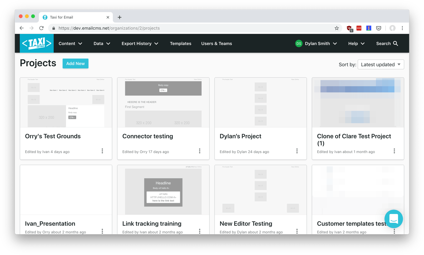
Taxi for Email is an email marketing workflow platform with best-in-class features… but you wouldn’t have guessed from looking at it. 3–4 years after it launched, the product was feeling very dated and becoming difficult to build upon.
A lot of utilitarian choices had been made on the path to profitability. Much of the app’s front end was visually inconsistent — there was little reuse of styles, and there were more colours and font sizes declared than you could imagine. The design, HTML, and CSS were originally based on the Bootstrap framework and then themed to the point that it was maintenance was nearly impossible.
An early stage startup lives or dies by meeting customer demands and that sometimes meant the CTO co-founder shipping features whether they’d been given proper design attention or not. I believe they made the right business decisions at the time but, as the first product hire, I was looking forward to helping pay down the design and technical debt.
Challenges & Constraints
The single biggest challenge this project presented was the sheer scale of it. When we started, Taxi already had dozens of features — we’re talking several hundred individual views in a Rails app — and many of them were unfamiliar to me. Questions like ‘can you explain the context of this feature?’ or even ‘what is this page?’ were common as we uncovered new corners of the codebase.
Our team was also in the middle of an agile transformation. We wanted to get some improvements out the door without getting distracted by all the issues I was finding that I could fix. That restraint meant that making changes to other important issues like taxonomy would have to wait.
Additionally, any makeover work had to consider the partners who offer whitelabelled versions of our product with some customisable branding options.
Approach
Redesign
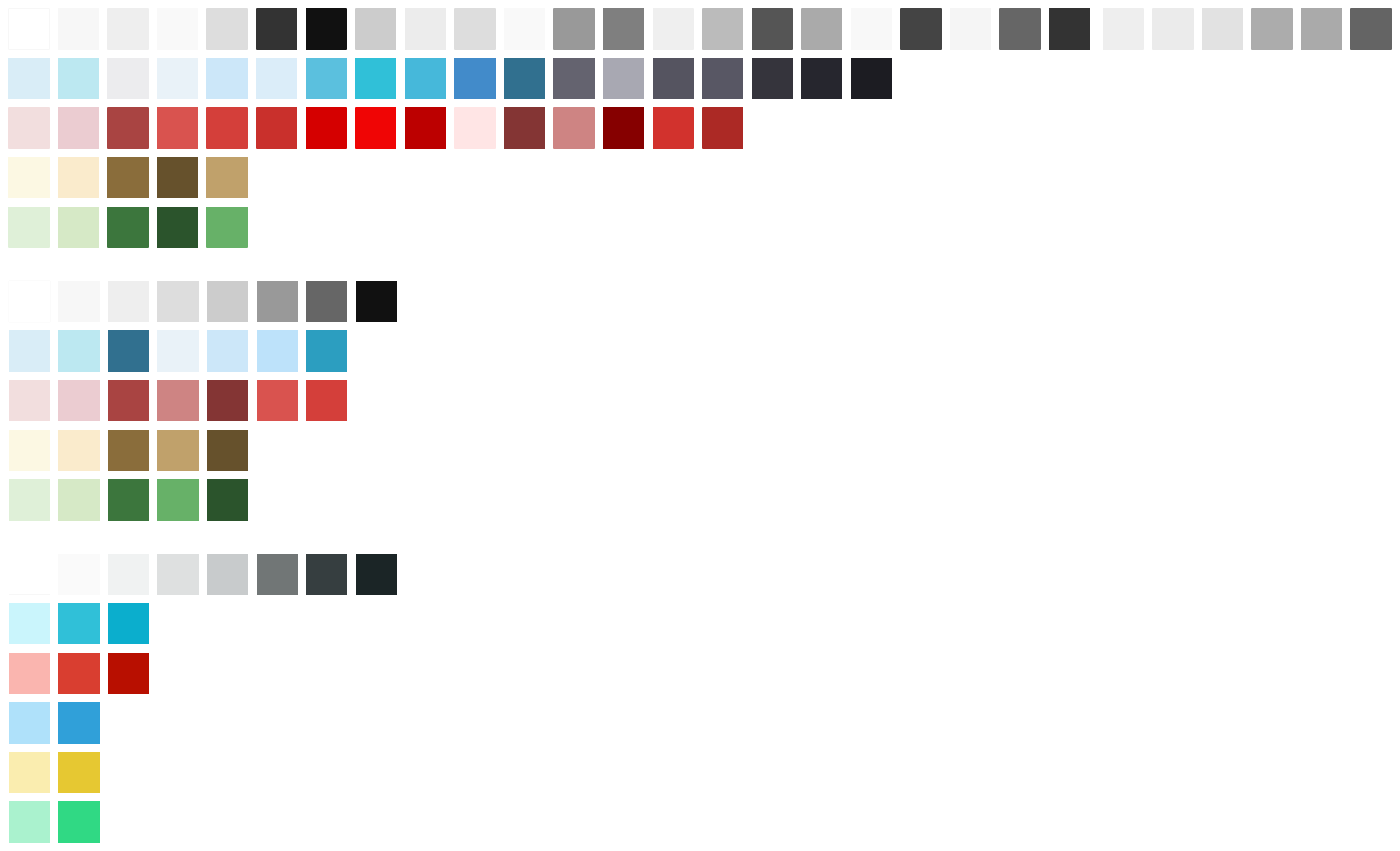
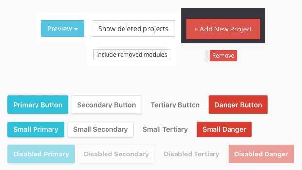
To get started, I conducted an ‘interface inventory’, a technique I learned about from Brad Frost. This involves combing through a website or product and collecting screenshots of all the visually distinct instances of similar elements. For example, Taxi had large red buttons, medium blue buttons, small white buttons, icon buttons, text links used as buttons, etc. Seeing them all in one place (I used a shared folder and Google Slides) allowed me to make a decision on which styles which were good, which were redundant, and which needed to go. I did this not only for buttons but also icons, headings, navigation, inputs, and every other type of visual element. By the end, I had a clear picture of the work required and an easy way to communicate that to our CTO.
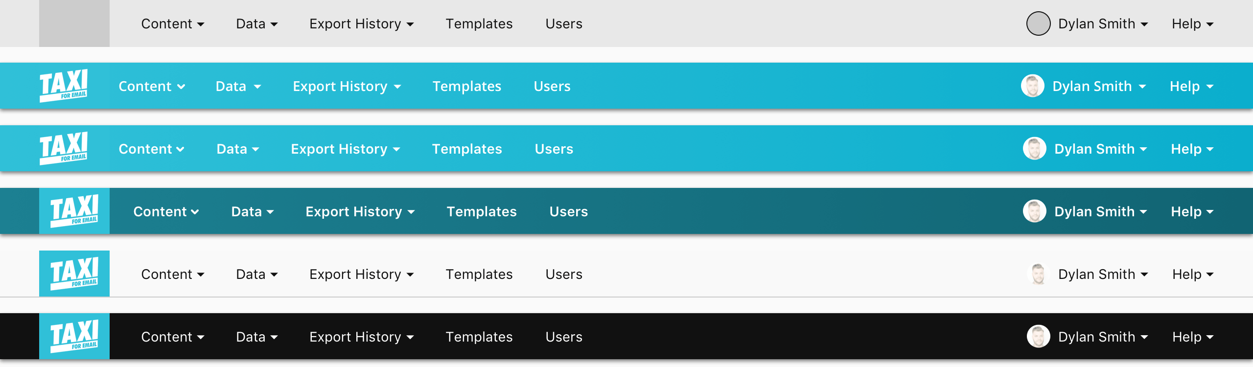
Then came the fun part: redesigning everything. Using Sketch, I explored in high-fidelity several variations and combinations of new visual styles. I worked on elements in isolation before using them to build larger components or sections, finally mocking up what existing pages could look like. This approach not only ensured that elements were individually strong, but that they worked together and that we caught instances where they didn’t before getting too far ahead.
Code
The next step was to build these modular and reusable building blocks out in code, which meant redoing the app’s entire CSS. Taxi’s previous approach was to include the entirety of Bootstrap as one file and add a second vanilla CSS file with brand-specific theming, overrides, and additional custom styles.
I replaced all of that with an SCSS folder structure. Because every one of the several hundred views I mentioned were filled with gratuitous divs and Bootstrap classes (the evil side of using a framework), it was easier to grab the existing grid system from a newer SCSS version of Bootstrap. I also kept styles for select components such as tooltips that may have caused unexpected behaviour if not included.
Otherwise, the CSS adhered to the BEM convention and mirrored the visual design’s modularity. I created partials with lists of variables for reusable values like colours, font-sizes, and border-radii. Other partials contained rules for elements and their contextual and state-based variants. Still other partials defined styles for components, sections, and higher-level page layout.
Design System
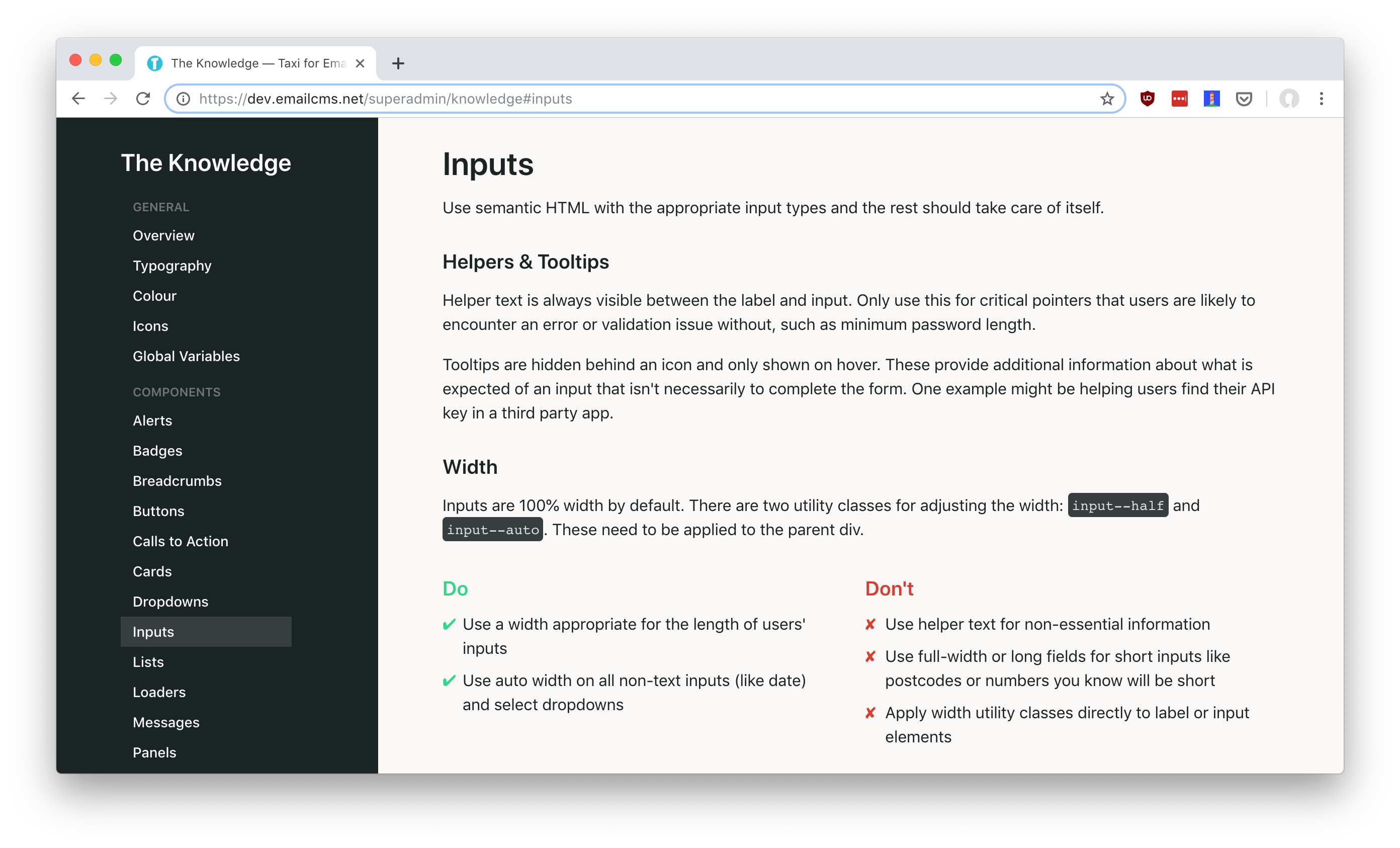
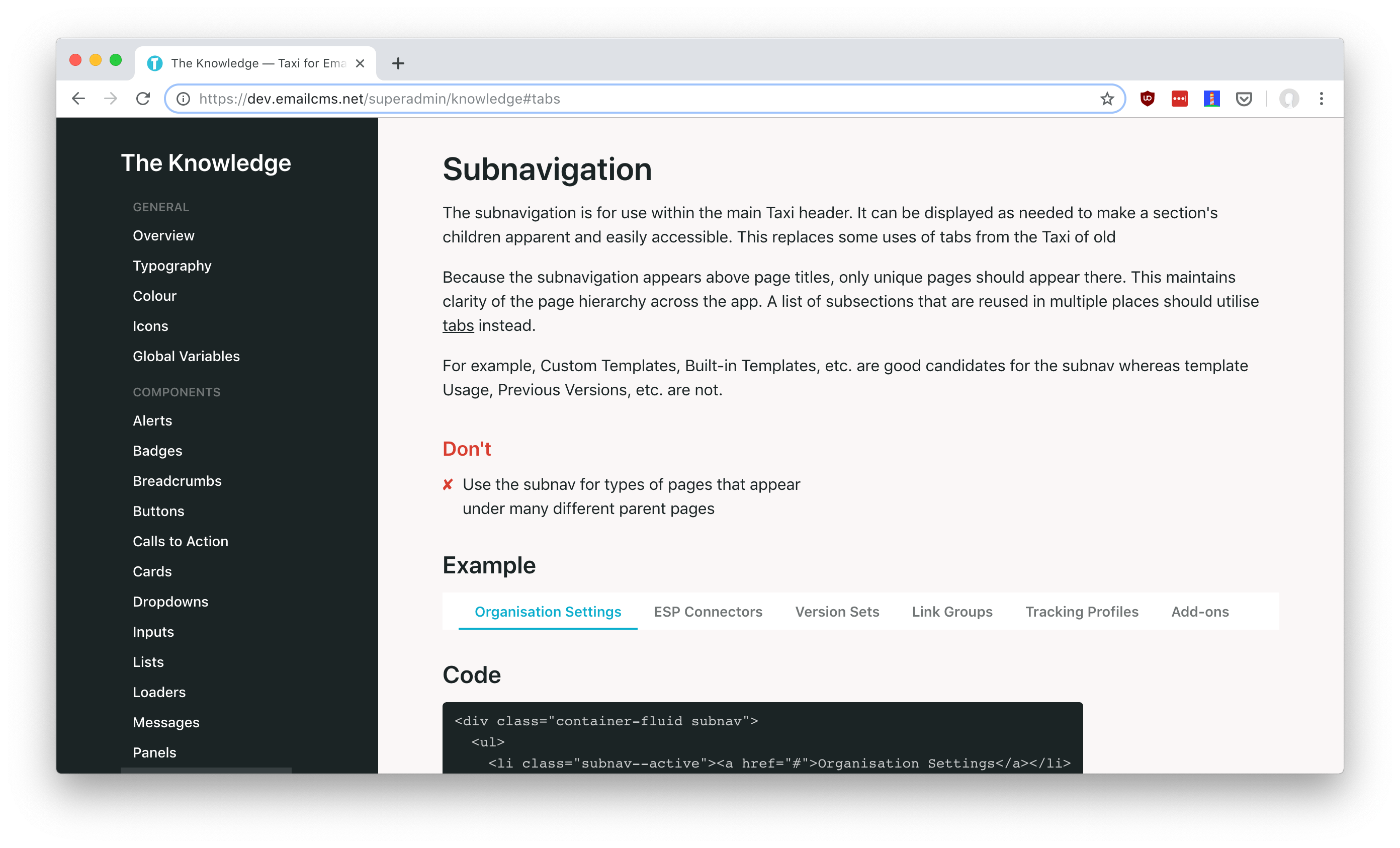
Because changes in markup would be implemented by two developers and me, and because there was so much app that I wouldn’t be able to personally ensure that the new elements were being implemented properly, I documented all of the patterns in a new design system. For each element and component, I explained what it is, how it should be used, and how it should not be used. The developers referenced the design system throughout the implementation process; if they had to ask clarifying questions, I answered them and updated our documentation to better explain.
An effort was made to limit the majority of the front end refactoring to CSS changes to reduce the time required making extensive changes to HTML. There was a lot of blanket find-and-replacing to change things like Bootstrap’s btn btn-primary classes to BEM-friendly button button--primary. Still, some structural changes were required to implement new components as designed. I worked with the developers to simplify some of those cases by utilising custom Rails helpers.
For example, file inputs were previously simple <input type="file"> elements; they became more complex, with parent and child elements to create the desired look and behaviour. Refactoring this way meant meant only switching that HTML for <%= taxi_file_upload_tag %> and keeping the complexity in a single place, allowing future changes more easily as well.

Outcomes
Positive feedback
Aside from a few outliers, email software tends to move at a very slow pace. Many large companies in the space haven’t made design tweaks ever. Because we’d never tested our customers’ tolerance for change, we rolled out our redesign over the course of a few weeks, with each user having the option to switch between new and old for a short period of time. I monitored the numbers during the rollout and the percentage of users on the new design stayed between 85–90% as it became more widely available. Feedback was positive and there was no noticeable increase in support queries.
Faster and more focussed
We now have the ability to prototype ideas and iterate on existing components much more quickly. Visual design and front end development time for new features has decreased to nearly none. We get to spend more time on how things should work rather than what they should look like. A typical workflow for the product team now involves discussing solutions, sketching flows and layouts on a whiteboard, and moving straight to code.
Easier to onboard the team
We have an increased understanding of the front end codebase for new and existing team members. With the design system as documentation, our developers can build out a lot of the front end themselves, without stressing over visual design and without designers having to micromanage implementation.
Design and code that’s our own
Finally, I drastically reduced dependencies on third-party software. I rolled select stable Bootstrap components directly into our SCSS and got rid of the rest of the framework. I removed open source fonts in favour of system fonts. And I switched out a third-party icon font for an SVG sprite of our own custom icon set. Our app now loads faster, looks more unique, and is easier for us to build upon.
Credits
I refactored the existing UI with software engineer Ivan Bashkirov and the support of CTO Will Lahr.