Goals
In Q2 2020 (March–June), a product team was formed with the very specific goal to “improve trial activation rate (TAR) by at least 3 points.”
We rallied around this mission:
Create the best first-run experience for all new users signing up for Litmus by helping them discover features and find value during their 7-day trial.
Approach
User research
We had data to show that we were losing a lot of users immediately after signup, not engaging at all. We hypothesised that this was due to UI complexity and lack of clarity around what was most important. Additionally, our core value proposition was a few screens deep and a user would need to create a new email project to find it, which they might not be ready to do immediately.
We ran user research sessions to better understand our trialists and their first impressions of Litmus, the learnings from which fuelled our ideation. Many participants found it difficult to find features and areas of the product. We used these specific insights to improve navigation and feature discovery, making sure new users experienced the best parts of Litmus and saw more of the product.
Opportunity-solution tree
Based on our research and known issues, we created an opportunity-solution tree (OST). This involved listing several possible opportunities and potential solutions, then pruning to decide which ones to try first based on confidence, effort, and other factors.
A/B testing
We released all our changes as isolated experiments so we could measure their impact compared with control segments. We ran about a half dozen experiments over the quarter. We also continued to run unmoderated usability testing with non-customers as we released updates to track where our changes were lacking and iterated accordingly. We made a number of additional UX improvements as we learned more from the latest test results and our continued research.
Solutions
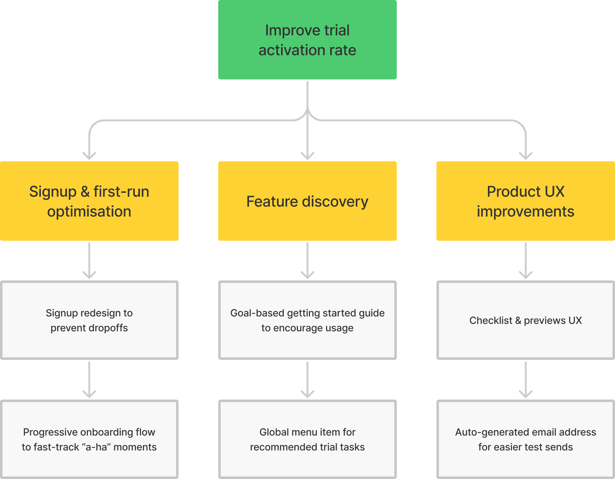
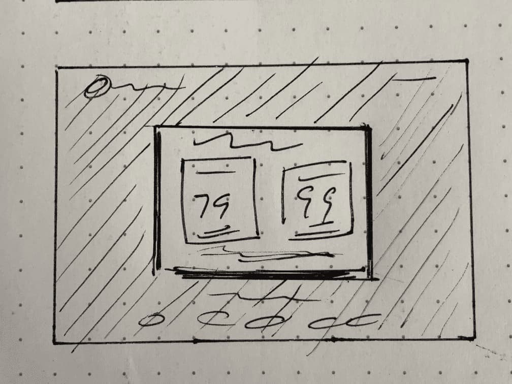
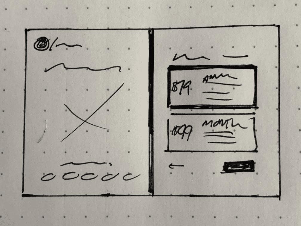
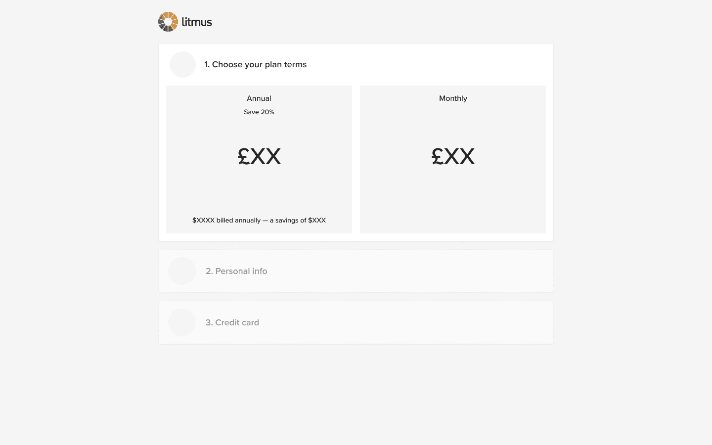
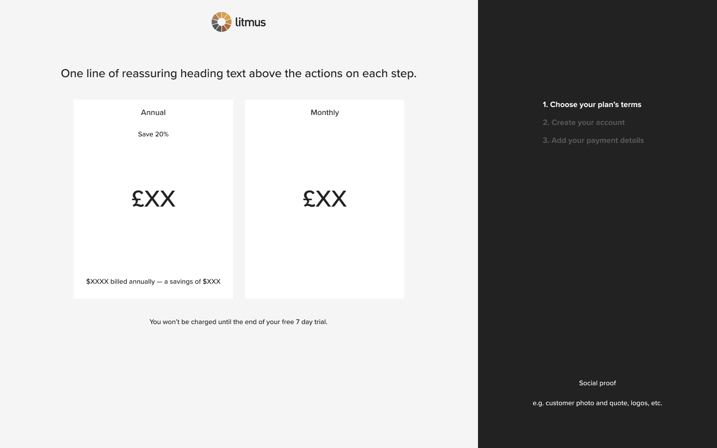
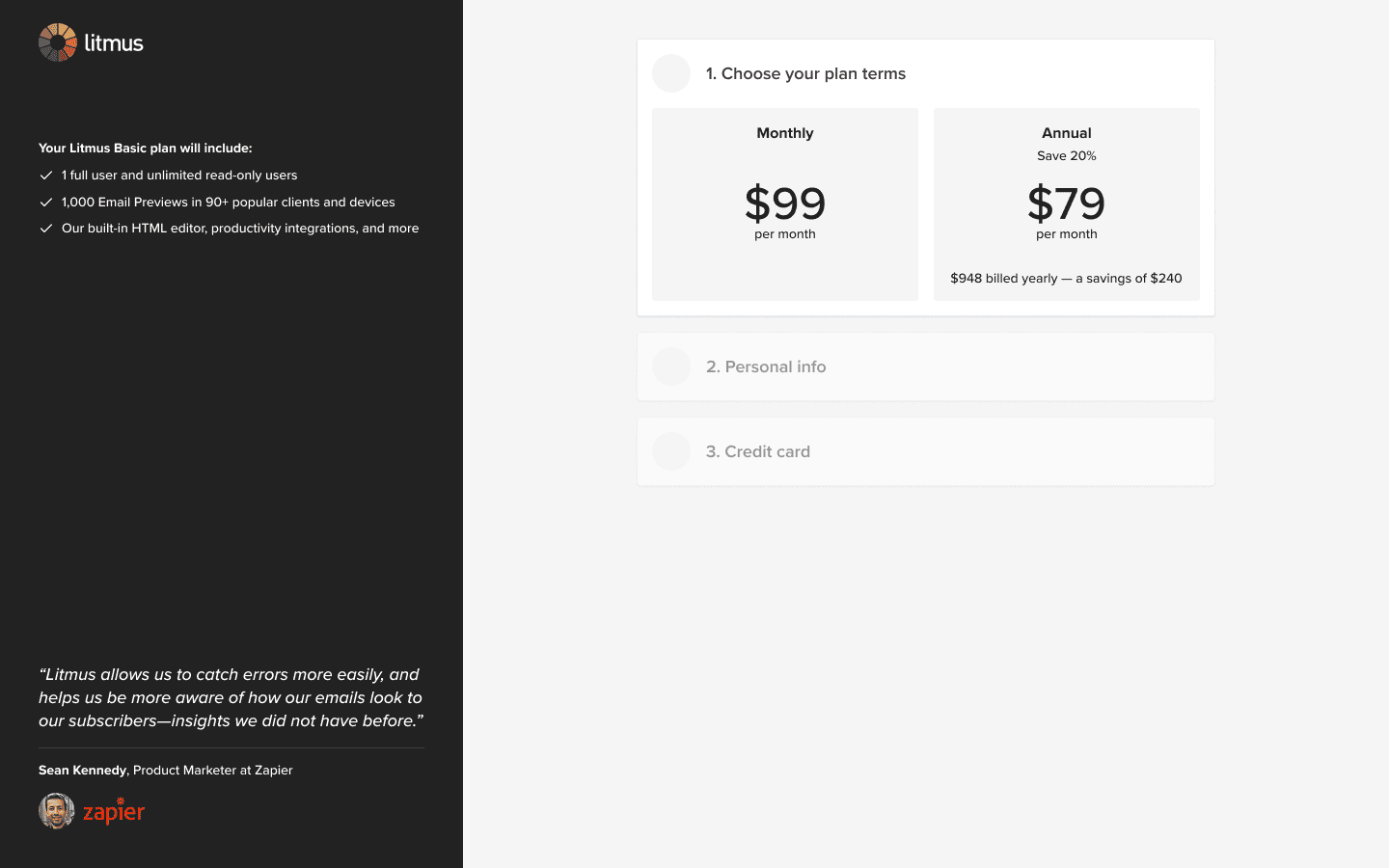
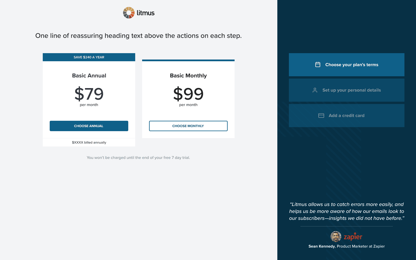
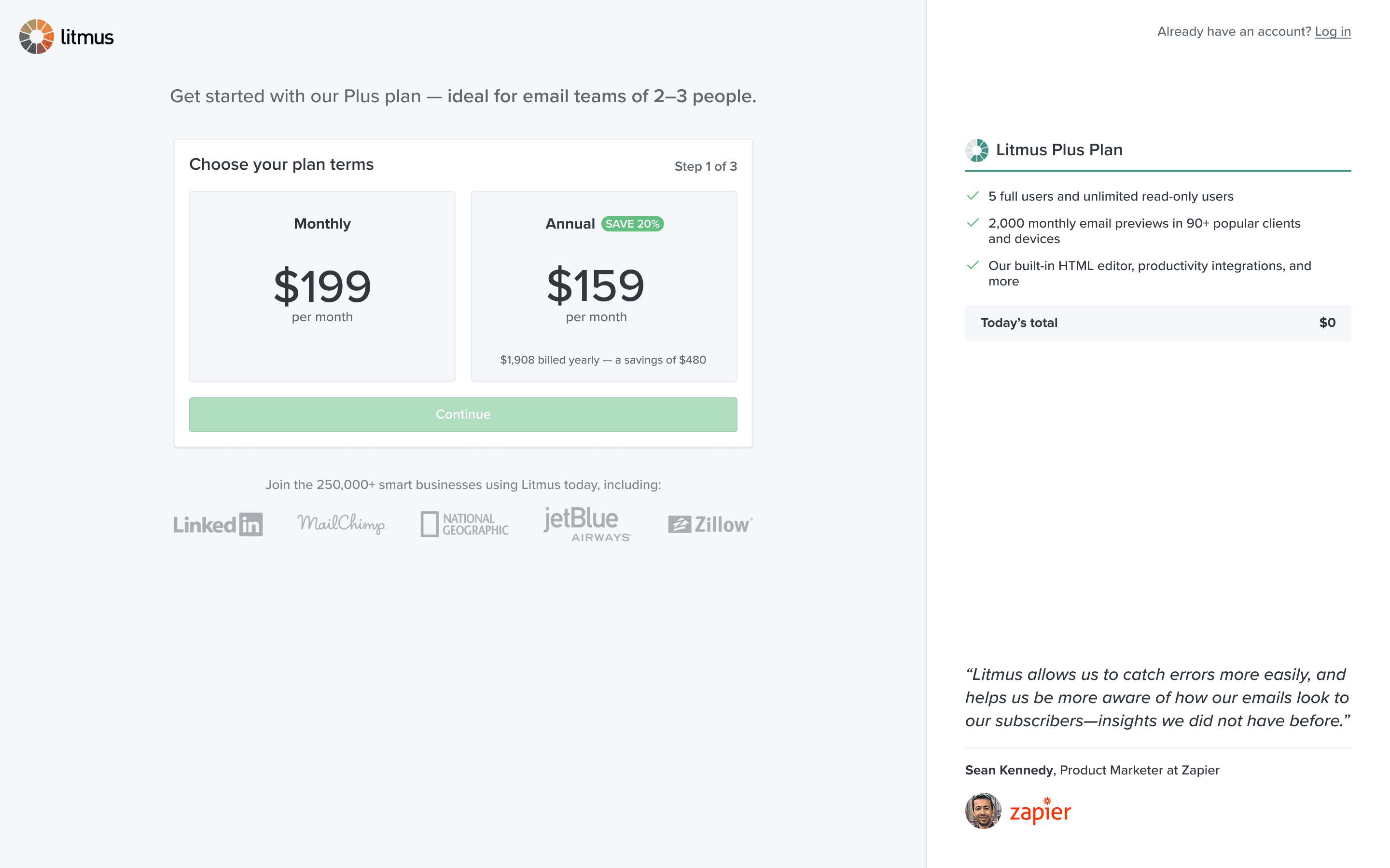
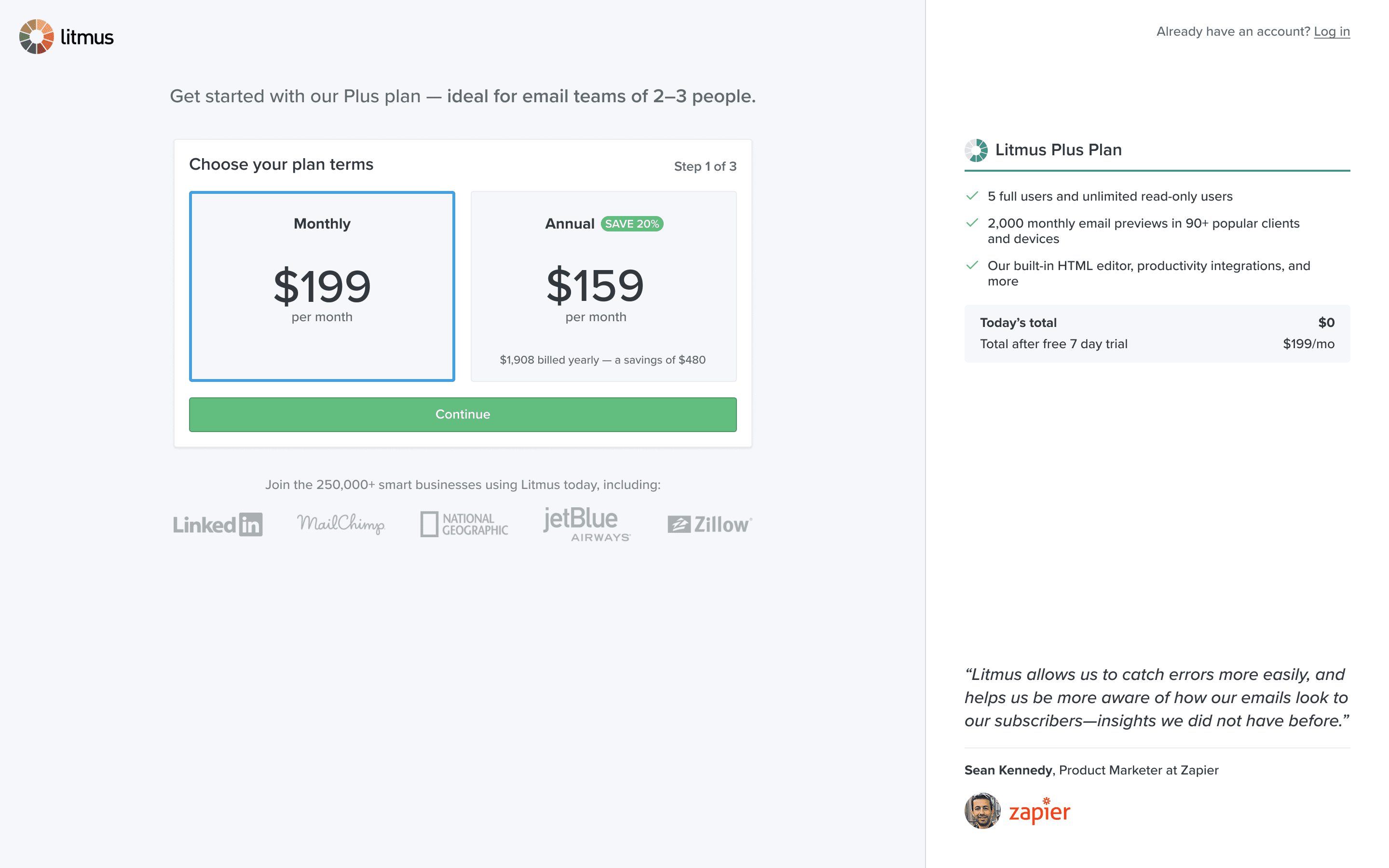
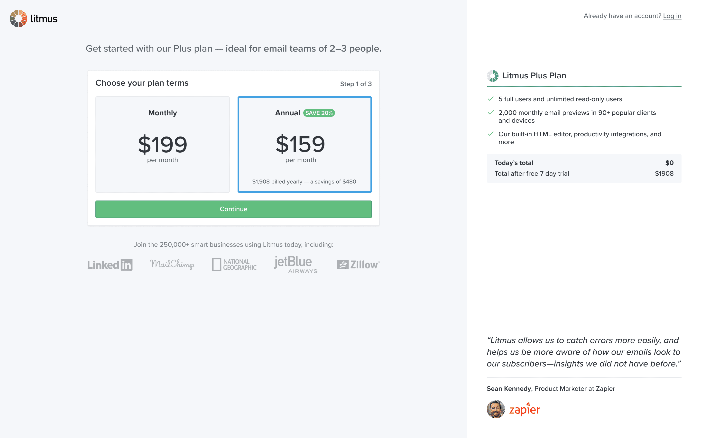
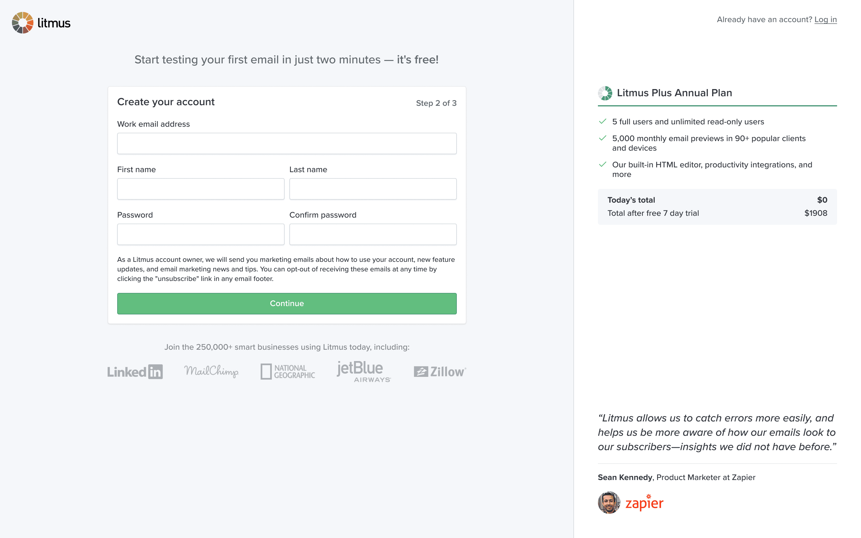
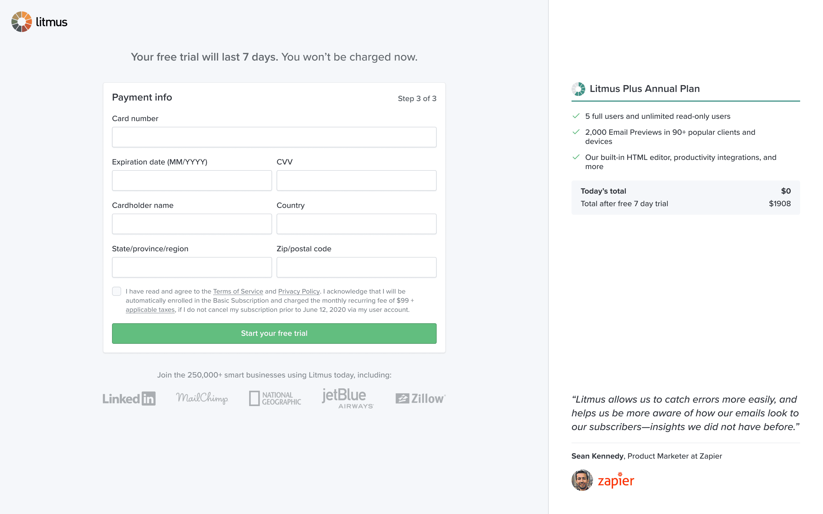
Signup flow
I worked with the growth marketing team to completely redesign the signup flow. Major improvements included simple comparison between monthly an annual pricing, crystal clear billing and payment expectations, plan feature overviews, and customer testimonials for social proof.
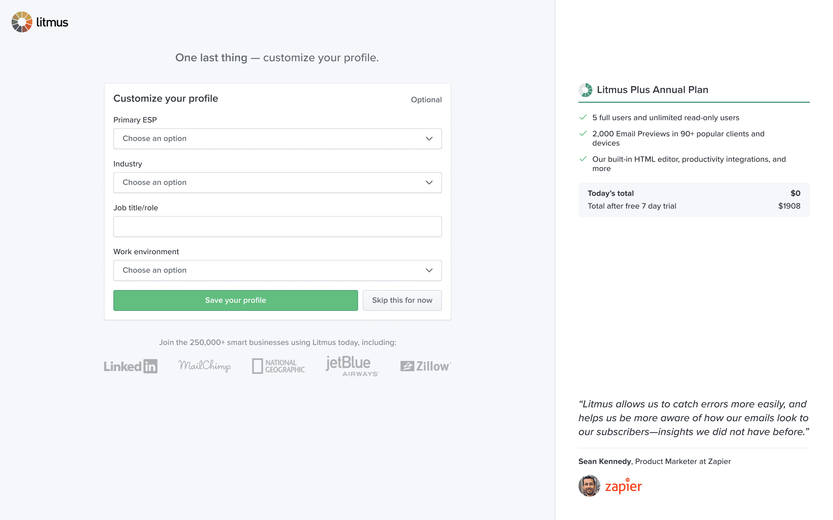
An optional step was added just before landing in the product to ask information about the user and their team. We knew this could be used later to personalise the in-product experience, another opportunity we identified but deprioritised in favour of simpler improvements.
Onboarding wizard
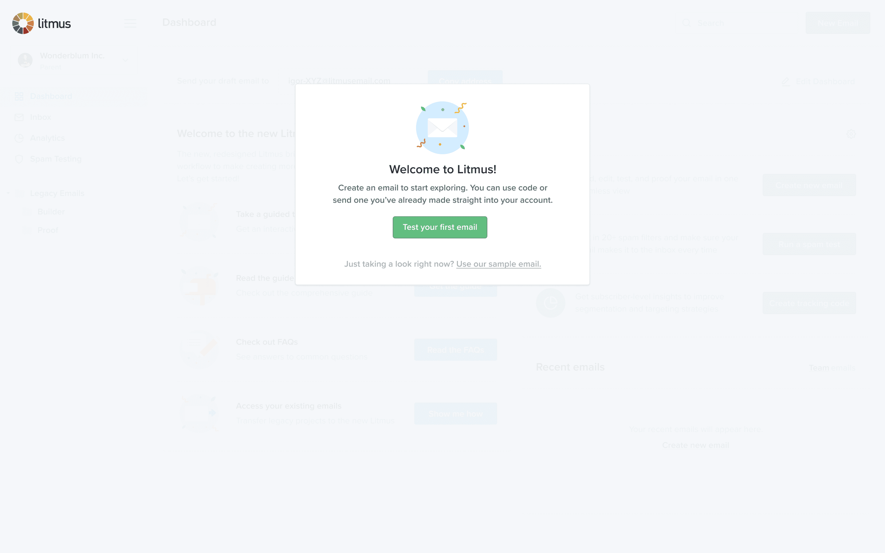
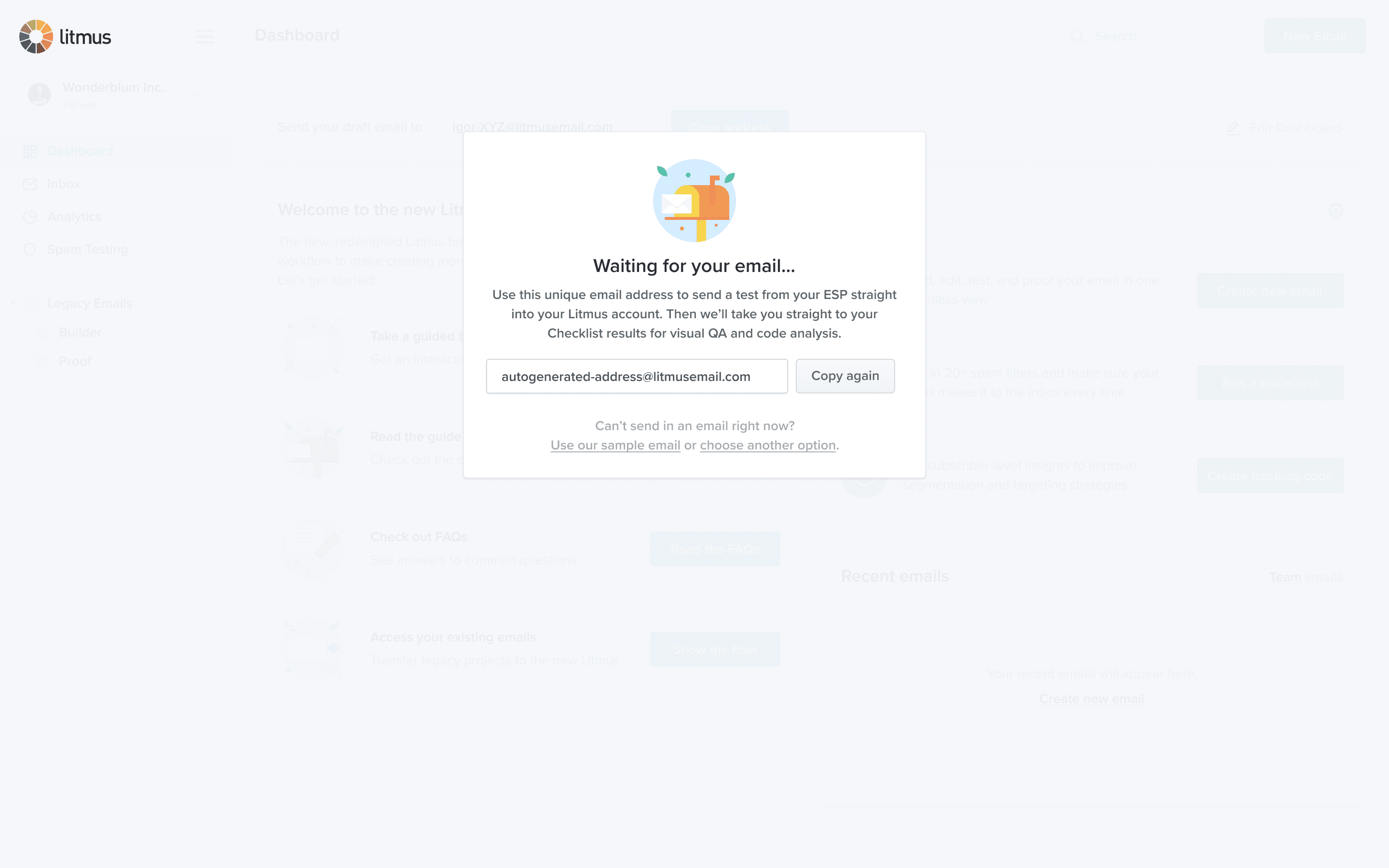
We knew from research that the product dashboard — the very first thing users see after signing in — was overwhelming for first-time visitors. All actions are presented as equal and it’s hard to know what to do first. I also knew from watching people in usability testing that our email client preview rendering and automated QA checklist has a big “wow” factor. My challenge was how to get them to experience that as quickly as possible.
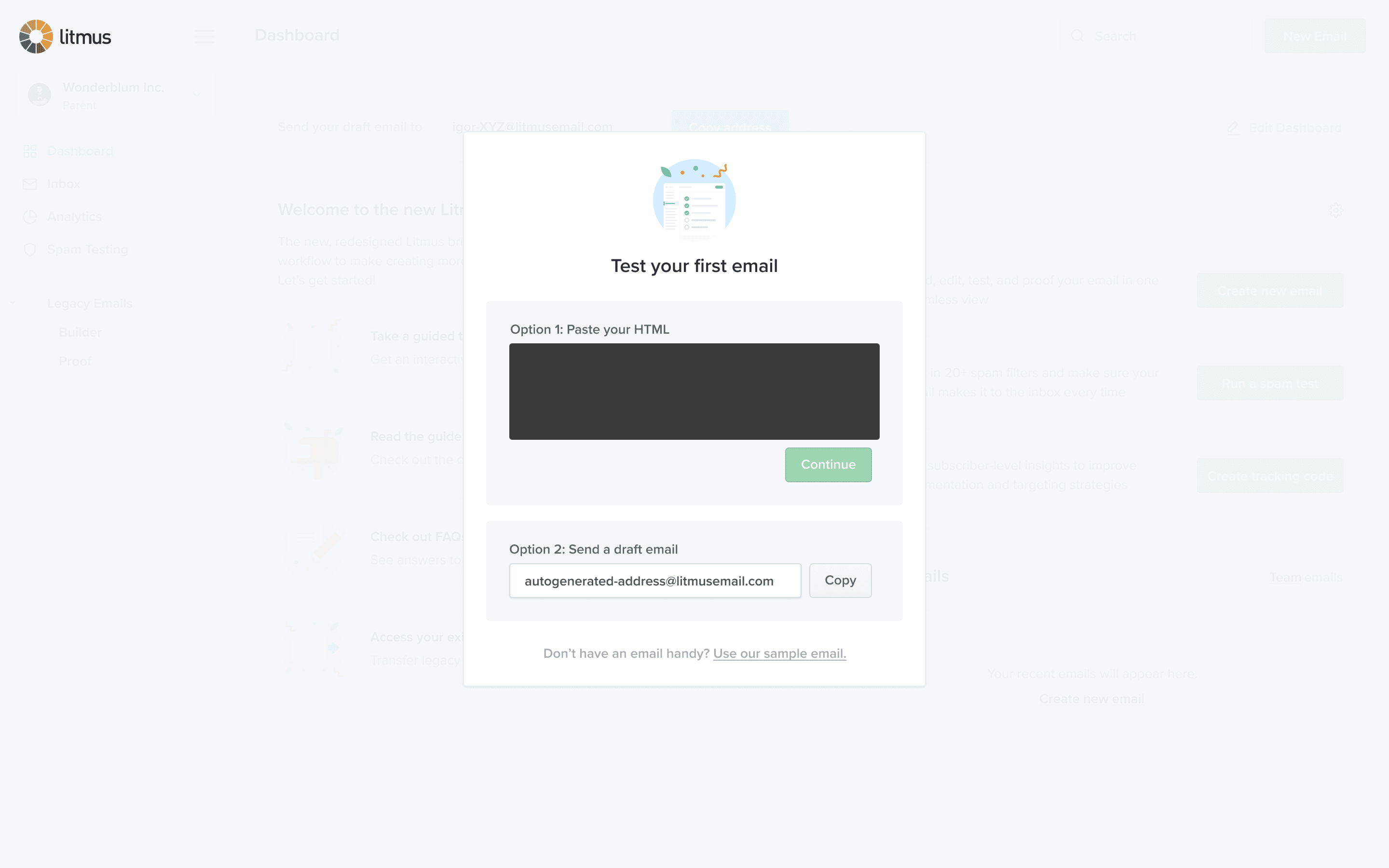
There are two usual processes for running email previews and QA tests:
- Create a new email, add code and content in Builder, save the document, “push” the changes to the email’s Checklist feature, then navigate there to view the results.
- Copy the account’s test email address, leave Litmus, navigate through an email service provider (ESP) to find an email for testing, send a draft to the test address, then come back to Litmus to see the generated results.
That’s a lot of chances for a new user to get confused, and having to leave the product you just signed up for to make the most of it felt awful.
I used a technique called progressive enhancement to offer a straight path to experiencing product value with no distractions, getting users to that “a-ha” moment in as little as a single click. From there, we reveal suggested next steps, allowing each user to dedide which secondary tasks are most important to them.
After rolling this out, we saw Day 0 usage of these features increase from ~75% to a peak of 92%. Data showed that about half of all users pasted code, a quarter sent a draft email, and a quarter used the sample.
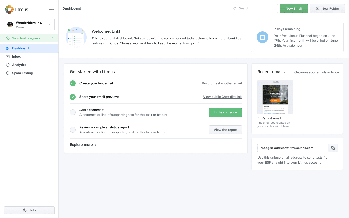
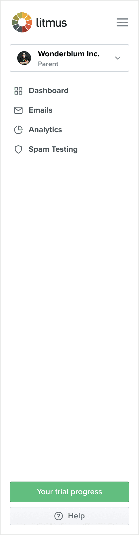
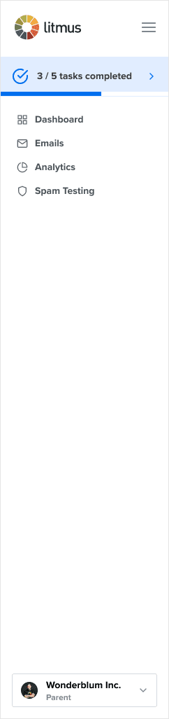
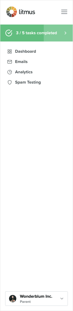
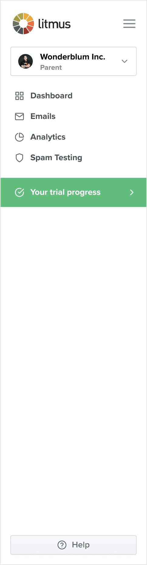
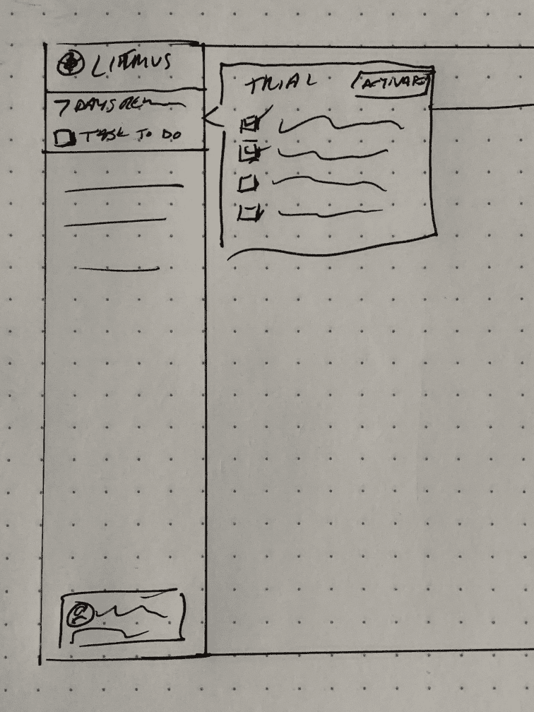
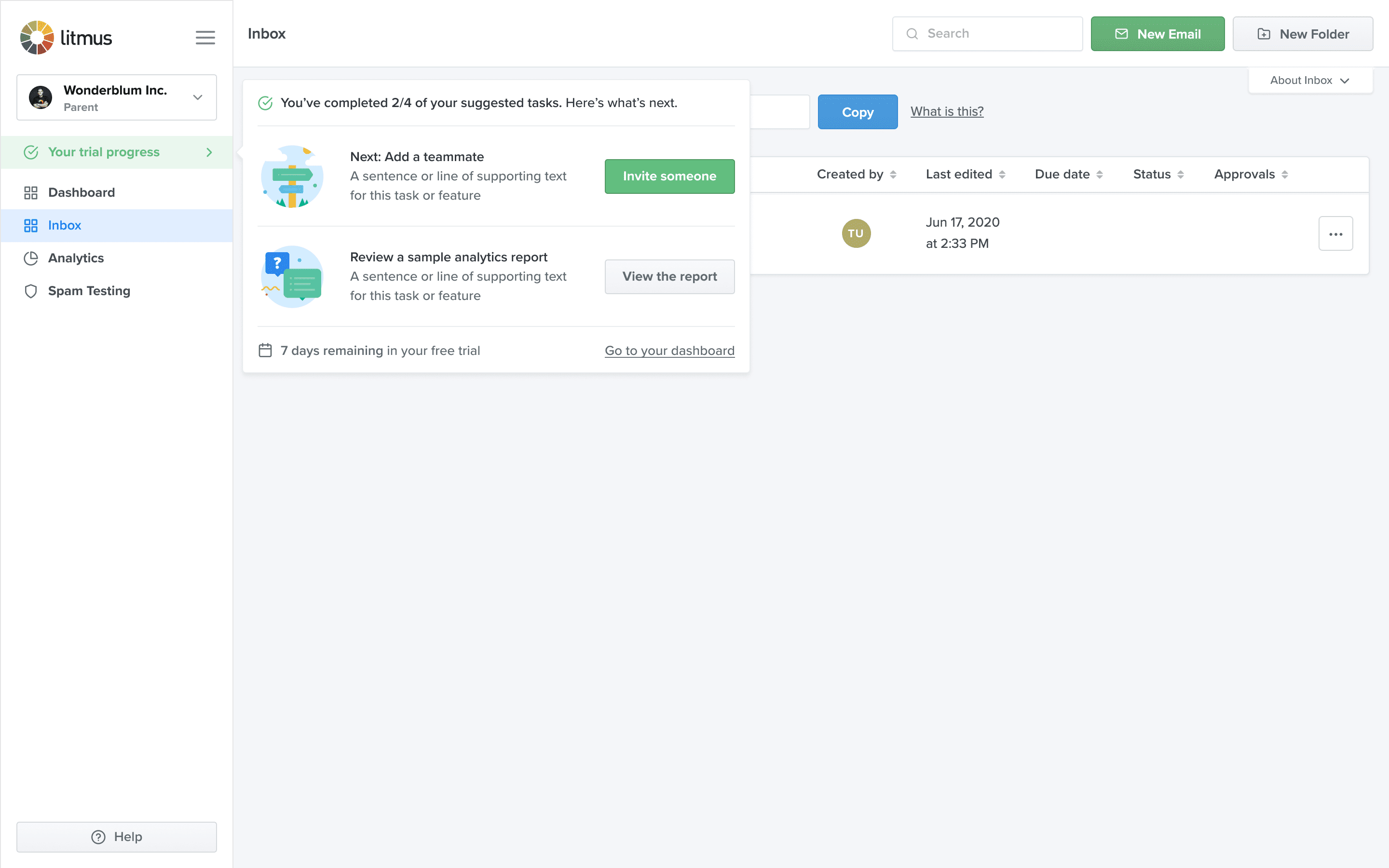
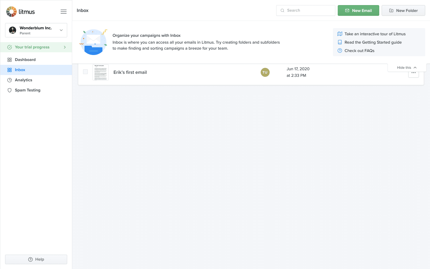
Trial dashboard
Our regular product dashboard is a table of recent emails. During a trial, however, customers rarely create enough emails to make it worth the most real estate on the most visited page in the app. We replaced that view with an onboarding dashboard that focussed on displaying key information and clear guidance.
The highlight of this page is a checklist of suggested tasks. Each task has primary and secondary actions, helping users learn the product and discover additional value even after the item has been completed. We split tested different combinations and orders of tasks which helped us identify UX improvements and the best arrangement.
A toggleable section below the checklist promotes more advanced features that might not be obvious from the main dashboard and navigation. This is collapsed by default and auto-expanded once more than half of the initial tasks are completed. Together the “get started” and “explore more” solutions led to increased average usage of every core feature during trials.
One small detail I defended was the date we‘d take their first payment. We had no billing reminder emails at the time. This problem contributed to unnecessarily high churn in months 1–3 when lapsed users would notice charges, complain to our customer support, and request refunds or file chargebacks. Providing more transparency with this one line reduced the number of unhappy trialists and work for our support and finance teams.
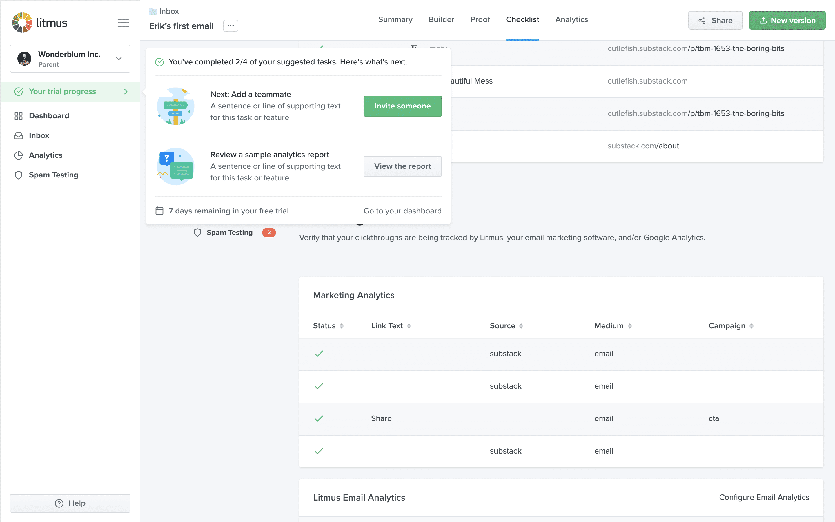
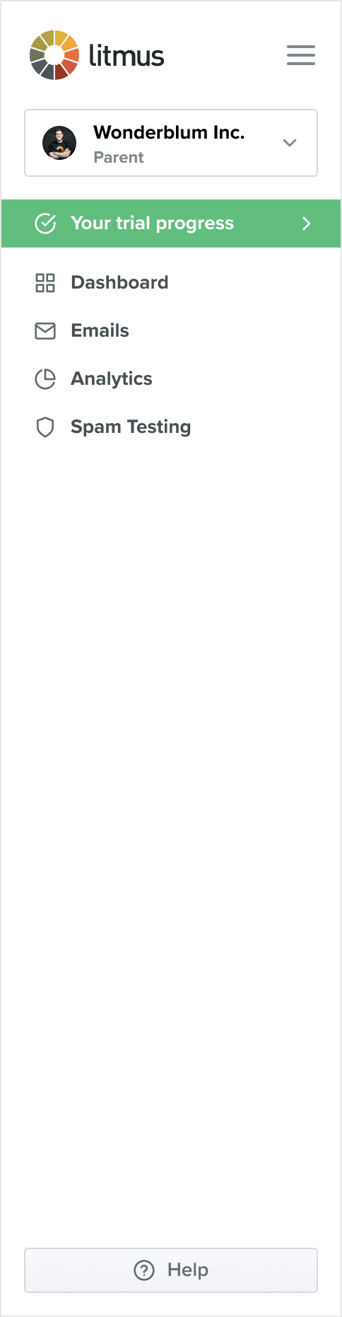
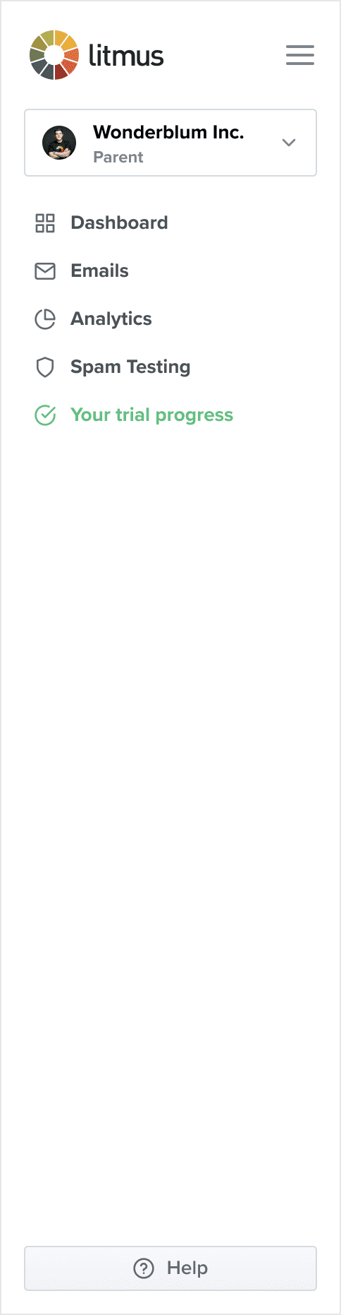
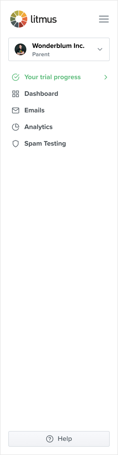
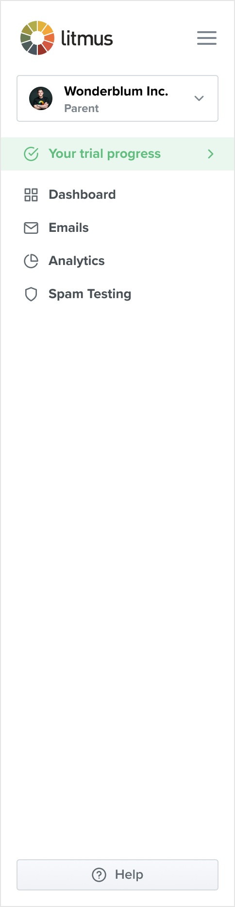
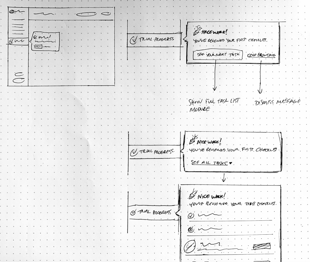
Global trial popover
Having the onboarding task checklist on the dashboard was a good start but I wanted to also make it available from any page in the app. This allowed us to automatically open it at key moments, like immediately after a user has completed a task, to reduce the chance of them getting stuck or losing momentum.
An example of this is shown at the end of the wizard flow above. In that case, the popover appears when the user has either stayed on the page a certain amount of time or scrolled through a certain percentage of the page.
The Drawer
It was impossible to think about the short period a user spends in trial without also considering the extended time they need to become truly familiar with a product. We don’t want all of the help and guidance to disappear just because they’ve started paying us. I dubbed this the “Day 8 Problem.”
One solution was to introduce an expandable element across all major feature areas that explained their purpose, offered tips for usage, and linked to relevant help articles to preempt common points of confusion.
We made this available to all accounts and users regardless of plan or state, proving helpful not only for trial users but also new users on existing accounts.
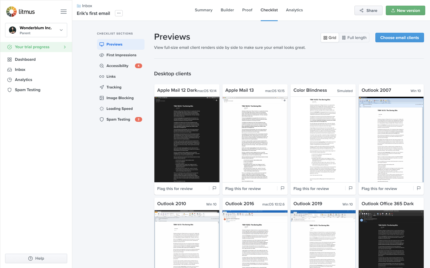
Previews improvements
Litmus’s core value proposition and biggest potential to quickly impress a new user is email client rendering previews. After we began guiding users directly to the feature on first run, it highlighted shortcomings with the existing experience.
One of our strengths is that we are the market leader in email previews. We have the largest number of email clients available and always have the latest devices released before our competition.
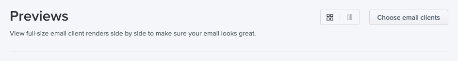
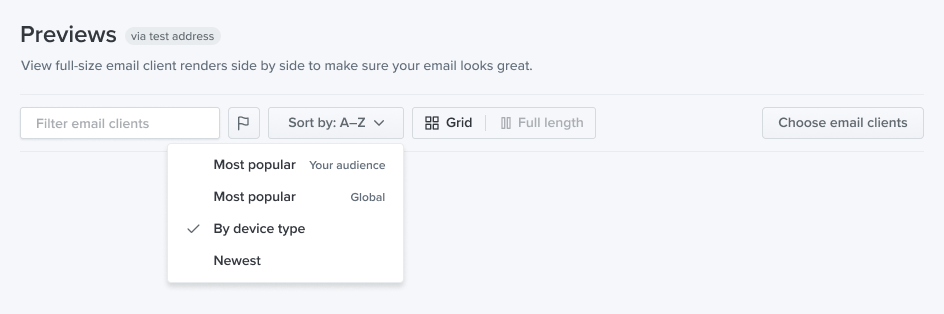
However, in my research, even our own email developer didn’t know she could toggle cropped and full-length thumbnails. Email clients were sorted only statically by platform: desktop first, mobile second. And if someone was looking for a specific client, they’d have to scroll to find it or know to use their browser’s built-in page search.
I wanted to make sure that if a user was looking for specific clients — especially if they were comparing us to the competition — they would find it easily. We ended up shipping the following improvements in short order:
- Added labels to the thumbnail toggle for clarity
- Added free text filtering by either email client or operating system
- Added filtering by flagged clients, an existing feature
- Added sorting options, including which clients are most popular with an account’s audience (reusing data from our analytics features)
- Reorganised the UI to put these options front and centre
We also suppressed some advanced features, like client recommendations, that only make sense once accounts have a certain amount of usage.
Results
Feature usage during trial rose across the board: 73% more email previews generated, 28% more QA checklists created, and 17% more Builder documents created.
Despite the COVID-19 pandemic striking just after the team formed, we managed to increase the trial activation rate increased over 50% to a new weekly high in June 2020.
Credits
I led product design on this project. My contributions included strategy and planning, user research, UX and visual design, and frontend development (HTML, CSS, Rails, Vue, and VWO for running experiments).
I worked with product manager Jay Patel and engineers Nishiki Liu and Matt Schwartz on team “Mavericks.” UX researcher Emily Alter and growth marketer John Kim provided support.