Builder is a core feature of Litmus where users can create and add content to HTML emails. Originally launched as a tailor-made code editing experience for email developers, a WYSIWYG mode was later added to appeal to non-technical marketing team members and encourage collaboration.
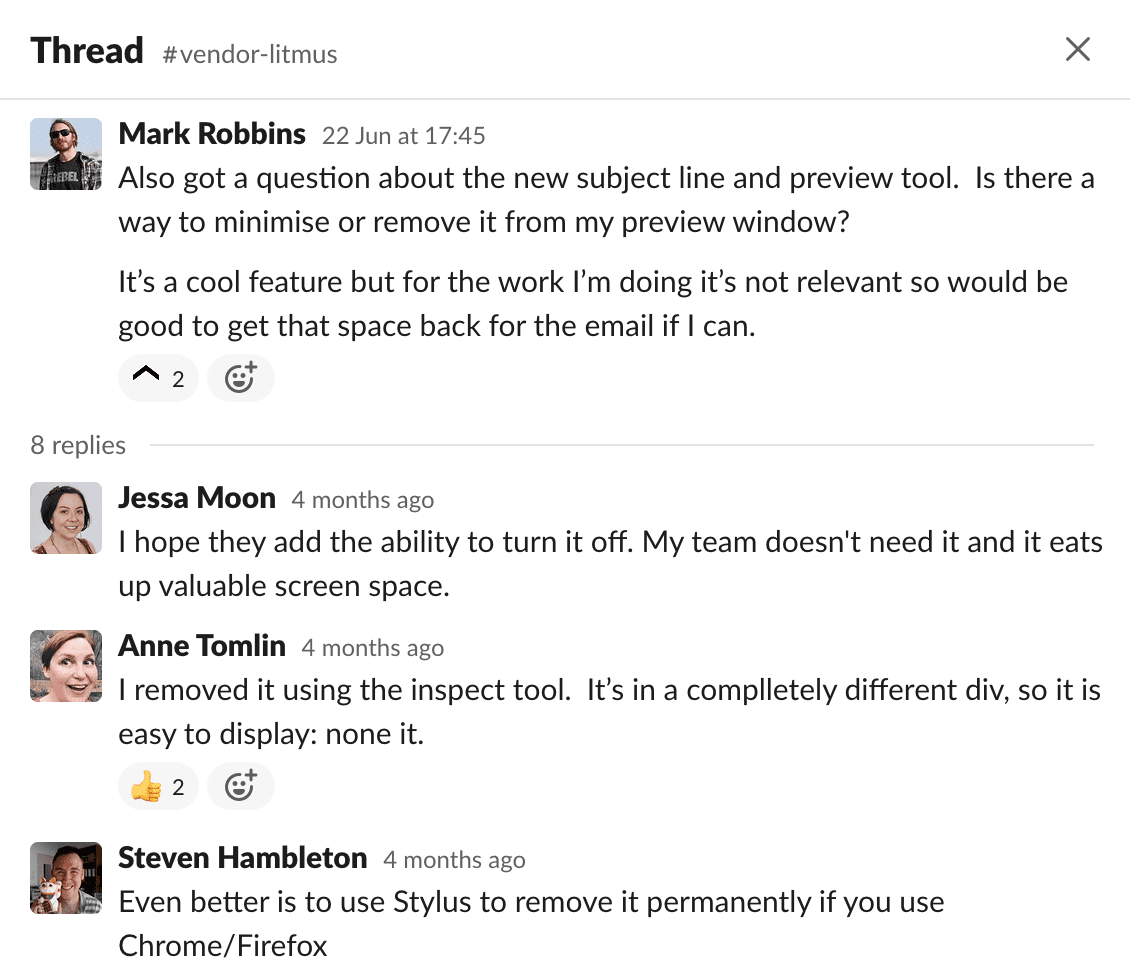
When the redesigned global navigation launched, it moved the main section links from the left side of the page to an additional header. This wasn’t a problem across most of the app but screen real estate in Builder was already at a premium, especially on shorter displays like laptops. Further features added to the live preview panel compounded the issue, and negative feedback from our developer users was swift and fierce.
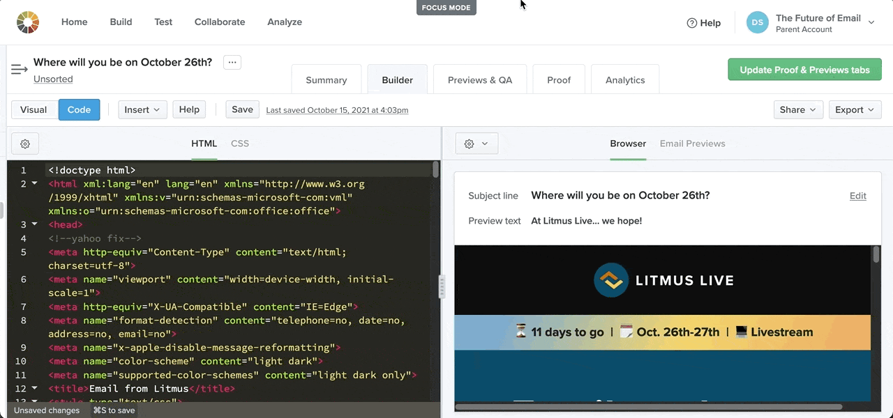
There are some technical constraints on the Builder page that limited options for a solution. The toolbar and the panels for code, WYSIWYG editing, and previewing are inside of an iframe element; the global nav, email title, and email tabs are outside. With this information in mind, I knew I could come up with a solution to expand the iframe to fill the page, hiding the rest of the UI and increasing useful display area.
There was some back and forth on where we should position the toggle button. We considered putting it on the toolbar beside or near the ⚙️ button. The top-middle of the page proved to be the better choice because it’s more discoverable and it doesn’t move; it’s in the same position whether you’re focussed or not, so it’s easy to toggle modes.
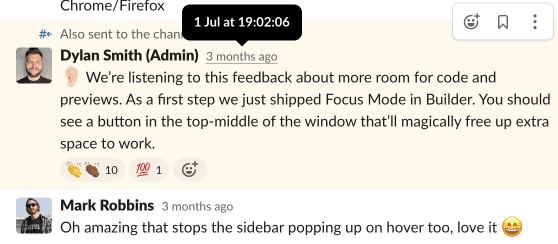
9 days after the first user feedback and 19 lines of JavaScript later, I shipped “focus mode.”
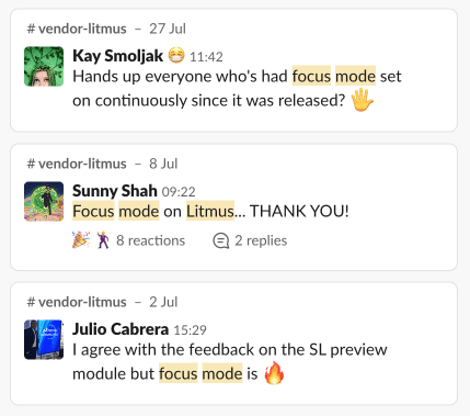
This feature isn’t a really big deal. It’s a bit self-inflicted because a more considered navigation pattern would have prevented the underlying problem altogether. (I wasn’t on the core navigation team.) But I do love that it was driven by feedback, explored and shipped quickly, and celebrated by users. Small, simple solutions to big pain points on short iteration cycles are so satisfying.
Credits
I collaborated with product designer Igor Izhik to decide the best placement and visual style of the toggle button.